
Wednesday night, Creighton unveiled their new logo and court design at a 5:30 ceremony inside CenturyLink Center. It’s both a radical departure and reminiscent of the past all at once.
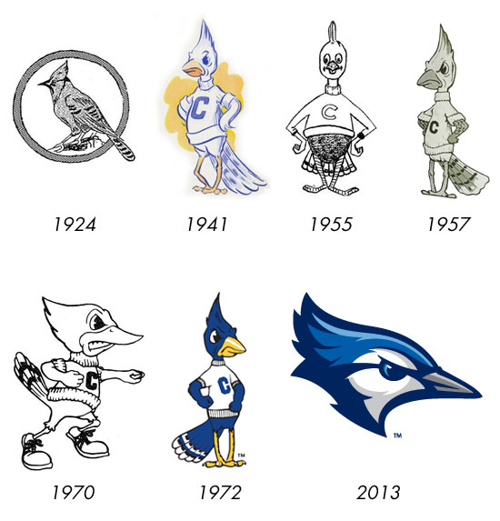
One on hand, it’s a radical redesign because, for the first time, the logo consists of just the bird’s head and not the entire body. On the other hand, there’s several elements that tie it to the past: it reminds me of the “Birdwatchers Bluejay” from 1924, in that it’s an actual bird and no longer anthropomorphic; it has a powder blue stripe on the top of the head as a nod to the 1970s men’s basketball uniforms that are so fondly remembered by many longtime fans; and the profile view of the head is reminiscent of the “angry” Billy from 1970.
That the design firm of Mongoose Graphics was able to successfully balance those two things is a credit to their work — this is a design that breaks new ground for CU while harkening to the past all at once. That’s harder to do than it sounds.
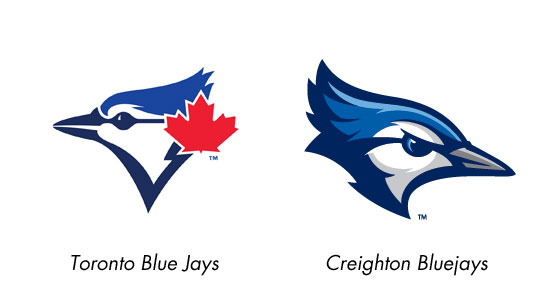
In a technical sense, the logo is really well-done — it has three-dimensionality without overusing the gradients and bevels that plague a lot of modern sports identity design. And it manages the inevitable comparisons to Toronto’s Blue Jay rather well, I think.
The primary form of the logo, however, is a version with the bird emerging through the center of the letter “C”. It’s less effective in this application, because the bird covers enough of the letter to make it illegible (if you already know it’s a logo for Creighton, this isn’t so much an issue, but if you aren’t aware of that fact, it’s problematic) and the colors blend together enough to obscure the details. In short, there’s a lot going on. Still, it’s a nice mark and I’m certain over time, it will grow on people. New logos and brands always take time to settle in; once the Jays are celebrating wins on a court emblazoned with this logo, it’ll have a completely different feel. Ask me again in March and I’ll have changed my tune, guaranteed.
With that said, I’d be remiss if I didn’t note that this logo will look terrific on merchandise and — perhaps most importantly with all the national television coverage the team will get this winter — it will look great on TV. That was always a downside to the previous logos; they didn’t reproduce well on TV, especially Billy, due to his height, relative narrow width, and the size of the spaces often reserved for logos on ESPN, Fox, etc. That left him at an awfully small size, and made him hard to pick out. This new mark will be bolder on-screen and will be hopefully lead to a more recognizable brand for Creighton.
The wordmark that replaces the “Jays” script has a couple of things that drive me nuts as a designer — I don’t like how several letters descend below the baseline and ascend above the topline, and the serifs remind me too much of DePaul for my taste — but those are nitpicky things only designers are bothered by. For everyone else, this is a pretty significant improvement over the “Jays” script thanks to the wonky, ham-fisted nature of that old script. If it wasn’t associated with the greatest two decade stretch of athletic excellence across all sports in CU history, I doubt that script would be as revered as it is; setting aside the fact that it’s inspiration is a terrible Kansas State logo from the late 1980’s, it never felt like it belonged with the rest of the brand.

This new wordmark is much more cohesive with the rest of the brand, and should give the school a much better overall look going forward. The new “Creighton Bluejays” mark accomplishes what I think the designers set out to achieve — creating a more flexible, more modern approach to a wordmark that fits well with all of the other graphical elements. I’m guessing the two words can appear either side-by-side or stacked, allowing it to fit nicely in different applications, and the way it’s designed allows it to be used in place of the words “Creighton” or “Bluejays” in advertising collateral. In fact, there’s some evidence of that already happening, as the “GoCreighton.com” website address on the bottom of the new schedule poster uses the wordmark in the URL. It also appears in a lockup with the new Bluejay in an alternate logo, further adding cohesion to the brand.
Now, on to the main event — the new court design. Creighton was entering it’s third decade of the old court design, as the 1994 court design from Civic Auditorium was left mostly unchanged with the 2003 move to Qwest Center Omaha (the only major change being the switch from “Bluejays” under one basket to “Omaha”). The new court has natural wood color in the keys rather than blue paint, and a massive version of the new logo at center court. It also includes the school’s official athletics website address for the first time. First National Bank remains the title sponsor of the court, but their logo is not inside a huge green box like the previous court, and is visually closer in size to other similar elements on the floor, lending a symmetry to the design that didn’t exist before.
My biggest fear with the new court was that they would go crazy and have a design that takes up 75% of the court, or go for a theme that overwhelmed the action on the court. They did neither, and that’s a good thing in my opinion. They modernized the design while making sure it still looked like a basketball court.
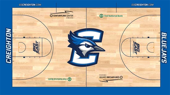
The new court design. (Image courtesy GoCreighton.com)
Overall, this is a really terrific upgrade for Creighton athletics. I was honestly prepared to dislike it, or even to hate it, and I’m surprised that I not only don’t hate it, I actually like it. I did not expect to have that reaction, given my emotional attachment to the previous brand. Perhaps that’s the best compliment I can give as a designer: that this is so well done I can’t help but fall in love with it.
Tom Nemitz has nearly 15 years of experience in advertising and marketing, and among his experience is rebrand campaigns for two local sports teams. His commentary and opinions in this piece are his own, and not those of White & Blue Review.