Editors Note: With Creighton set to unveil their new logo at a ceremony Wednesday evening at CenturyLink Center, we thought it would be fun to look back at the history of Creighton’s logos. Through old press clippings, yearbooks and issues of The Creightonian, we compiled this visual history of the Bluejays.
Creighton University was founded in 1878, but it wasn’t until 1924 that their mascot was the Bluejays. During the 46 years in between, their athletic teams were known by the moniker “Hilltoppers”, or occasionally, simply the “White and Blue.”
A contest in December of 1923 changed all of that. The Creighton Athletic Board commissioned the Omaha Bee newspaper to ask their readers for suggestions on a mascot for the school. According to a 1983 article in The Creightonian, the contest received over 200 entries, including “Golden Rods”, “Counts”, “Wynners”, “Blues”, “Shamrocks”, “Tigers”, “Bears”, and “Bluejays.” On January 14, 1924, the Omaha Bee announced the winner — “Bluejays” — spelled as one word (unlike the actual bird, which is two words).
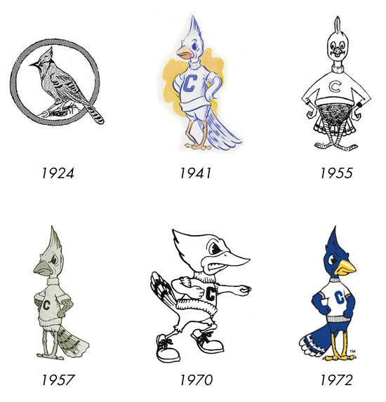
The first logo was an actual blue jay, placidly perched atop a branch. Variations of the “Birdwatchers Bluejay”, as it was called, were used for 16 years. Then in 1940, a journalism professor named Joseph P. Murphy — a 1938 graduate of Creighton who was now the yearbook moderator — decided it was time CU had a more lively mascot. He hired an artist in Ames, Iowa, to develop a caricature of a Bluejay, and when it debuted in the 1941 yearbook, the mascot was shown in a series of cartoons depicting the everyday life of a Creighton student.
The bird would remain nameless until after the war, when it was dubbed “Billie Bluejay”, later to be modified to the current spelling of “Billy.”
Murphy shared his memories of the process in developing the logo and mascot with the Creighton Alumni News in 1982.
“His ancestors at Creighton were insipid-looking creatures pictured perched on dead branches or in dusty trophy cases. Billy, when he arrived at Creighton, brought his family out of the pages and cages and into the hearts of Creighton fans. Compared to his predecessors, he had life and attitude. Billy had a human stance, and a psyched expression that inferred ‘Don’t Mess With Me.'”
By 1955, Billy did a 180-degree turn — he tipped the scale at a much heftier weight, and sported a friendly disposition as opposed to the gritted-teeth fierceness of the original. The illustration was closer to a dodo bird than a blue jay, and thankfully, it went the way of the dodo soon after it’s unveiling. Just two years later, the university returned to the 1941 original, altering the tail feathers slightly, giving him a meaner posture, and using a smaller “C” on his sweater.
In 1970, it was once again time for a makeover. This time, Billy was given a more athletic build, tennis shoes and the ability to be adapted for different sports or activities. He was depicted dribbling a basketball, wielding a baseball bat with a glove on his other hand, and in his default pose, Billy took cues from Carl Douglas and did some Kung Fu Fighting.
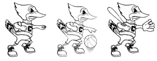
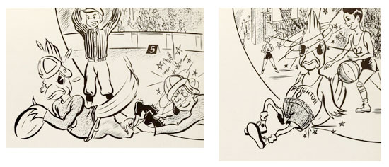
Three variations of the 1970s-era Billy Bluejay mascot. (Images courtesy Creighton University Archives)
This “angry” Billy was wildly unpopular, and after a litany of complaints were lodged by alumni who feared the look was, according to a 1976 article in The Creightonian, “too radical and fierce”, the school once again returned to a logo styled after Murphy’s original 1941 design. This time, however, Billy was turned to face right instead of left, and rather than resting both hands on his hips, his left arm was extended in front of his torso, with his hand balled into a fist.
With only slight modifications over the years since, this is the version of Billy Bluejay in use today.
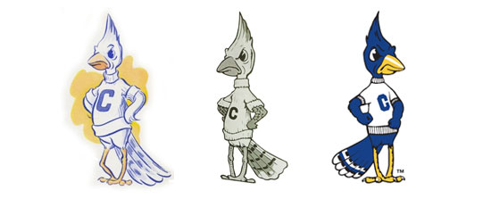
For comparison: the original Billy Bluejay as depicted by Joseph P. Murphy in 1941, and the two variations since.
Billy Bluejay has been around in one form or another for over 70 years, and up until the late ’70s, was more or less the only “official” logo used by the school’s athletic teams. However, they’ve had a variety of secondary and alternate logos through the years, including multiple designs incorporating the letter “C”.
The first of these appeared on track & field uniforms in the mid-1920s. An “old english” C, in subsequent years it would also be used on football and tennis uniforms. There’s photographic evidence in the CU archives of the old english C in use as late as 1940, but by then, the football team had moved on to another variation of the letter — a sans-serif treatment, slightly askew.
In the late 1940s and early 1950’s, a block “C” started appearing on everything from baseball caps to basketball warmup jackets. It eventually spread to cheerleader sweaters, letter jackets, and other spirit gear, and when the original Billy Bluejay was brought back in 1957, this new block “C” was on his sweater instead of the more rounded version on the 1941 original.
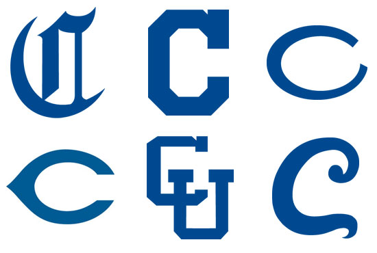
Various logos incorporating the letter “C” through the years. (Images courtesy Creighton University Archives)
There’s photographic evidence of the “Wishbone C” logo, popularized by the Cincinnati Reds and Chicago Bears, in use by Creighton as early as 1968 on their baseball caps. It remained in use until the mid-1970s, when Creighton began toying with their visual brand. In 1977, Creighton returned to the Missouri Valley after three decades as an independent, and celebrated their return by adding not one but two colors to their palate, and introducing a litany of alternate logos.
For men’s basketball, at home they wore traditional white jerseys with blue trim, but on the road they wore powder blue with marigold trim. They also introduced the “interlocking CU” logo, a variation of which would appear on their shorts on and off for most of the next two decades, and which would eventually creep onto baseball jerseys and caps.
For baseball, things got crazy. First, they sported a logo inspired by the St. Louis Cardinals — instead of cardinals perched on a bat, there were blue jays! A few years later, they introduced a “Creighton” script that was (assumedly) inspired by the logo for the band Chicago. The “C” from this logo was pulled out and used as the cap logo. For Willis Reed’s first season as head coach of the men’s basketball team in 1982, it became part of their visual brand as well, appearing on the basketball warmups, the cover of the media guide and even game programs and pocket schedules.
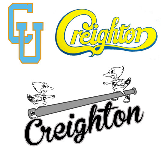
Alternate logos from the late 1970s and early 1980s. (Images courtesy Creighton University Archives)
The craziness subsided somewhat when Tony Barone took over the men’s basketball program in 1985. The interlocking CU returned (albeit in a widened format), the marigold accents went away (though powder blue stuck around), and the “Chicago” script was retired from use in men’s basketball. Likewise, Jim Hendry’s arrival on campus to take over the baseball program saw the retirement of that script altogether, in favor of a logo that once again draw inspiration from a Major League team — this time, the Toronto Blue Jays. The “Wishbone C” returned to the caps when Hendry took over, and has remained ever since.
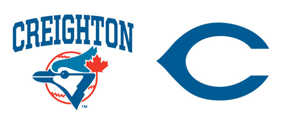
At left, the “Toronto” style Bluejay that was used by the baseball team during their late-80s and early-90s era, alongside the traditional “Wishbone C” which returned to their caps.
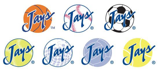
By 1994, Tony Barone was gone, the Rick Johnson Era had been a disaster, and Creighton was eager to make it clear they were starting a new era. So they rolled out the most comprehensive rebranding effort since the introduction of the original Billy Bluejay in 1941 — a completely new script and logo inspired in part by their new basketball coaches’ previous employer. The “Jays” script over a basketball was reminiscent of Kansas State’s “Cats” logo of the late 1980s, and soon became the primary logo used by both men’s and women’s basketball. By 1996, versions of this logo were adapted for all major sports, with soccer, baseball, volleyball, tennis, softball and golf all getting variations. The “Jays” script was also used as a standalone logo, without a sport-specific ball for a background.
These logos soon supplanted Billy Bluejay as the primary logo for athletics, a move made obvious when Billy was removed from midcourt at the Civic Auditorium in favor of the “Jays Basketball” logo. The newly abbreviated “Jays” brand was associated with the period of greatest success for Creighton athletics as a whole, and is now (unbelievably) entering it’s third decade.
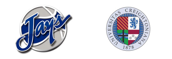
While the other six major sports have continued using those logos, men’s basketball refreshed the design in 2011 before Greg McDermott’s second season as head coach. Using 3D elements and incorporating a new color — silver — it updated the nearly 20-year old design while staying true to the original. Meanwhile, men’s soccer began using the Creighton University crest on their uniform kit, an odd choice given it’s traditional purpose for ceremonial use only.
It’s been nearly 20 years since the Jays’ have rolled out new logos, and over twice that long since Billy Bluejay got a makeover. Will whatever the school unveils on Wednesday night have the good fortune of being around that long? Only time will tell.
